
Why Brexit, Dom? 1: you’re a racist
Why Brexit, Dom? 2: you’re a communist
Most of the potential motives for Brexit that I’ve imputed to you so far have been, shall we say, less than generous. Not that many would blame me; the Leave camp wasn’t exactly awash with noble intentions. Most of your allies were self-serving faux-racist demagogues, avaricious business leaders, no-mark, no-brain backbench MPs and hasbeens hellbent on avenging Thatcher’s downfall, and crooks.
We must now consider the notion, however perverse, that you acted in good faith. That despite sharing methods with the Nationalsozialistische Deutsche Arbeiterpartei of the 1930s and the Communist party of the Soviet Union from the 1920s to the 1950s – the Big Lie, short, simple and false slogans, demonising minorities, crowbarring open social divisions – you don’t necessarily share their aims. That instead of being a 24-carat cunt, you are merely a Dreadnought-class dimwit.
But if you genuinely believed Brexit would benefit the UK, that raises the £350m question: why? What principles was this belief founded on? Who is Dominic Cummings?
Too cool for schools of thought
Most people are upfront about their philosophies. They’re happy to be described as communists, environmentalists, centrists, or Muslims, because that’s how they describe themselves. You, though, have always tetchily resisted being pigeonholed. (Which to me smacks of the schoolboy desire to be seen as cool, edgy, a maverick, an outsider, whereas in truth your punk-rock credentials extend to sometimes wearing your Wednesday socks on a Thursday.)
When someone refuses to be labelled, you have to build a picture of their world-view the hard way: by looking at their influences, their associates, their words and their deeds. Since you haven’t actually done anything, that just leaves your influences, associates and words.
I’ve already mentioned Norman Stone, your history tutor at Oxford, who evidently left quite a mark on you (albeit a different sort of mark from the ones he left on his wives). Stone was a hater of institutions, a deep blue Conservative, and a staunch fan of Margaret Thatcher in particular.
When you came back from Russia in the late 1990s, you threw your lot in with Business for Sterling and the No campaign, which opposed the UK joining the euro (slogan: “Europe yes, euro no”. How quickly things change). This was populated by most of the same rights-and-standards-phobic CEOs who later campaigned for Brexit – Lord Wolfson, Lord Bamford, Rupert Lowe, Tim Martin, Richard Tice, Jonathan Warburton, Lord Sainsbury – and the remaining dregs of Thatcher’s toadiest toadies, Lawson, Rifkind et al.
After a stormy period advising Iain Duncan Smith when he was leader of the opposition, your next big project was the New Frontiers Foundation, a free-market libertarian “thinktank” (a word that should send shudders down every spine) that called for the dismantling of the BBC, the civil service, the EU and the UN. Your chief partner in crime there was James Frayne, who has spent his life since writing evidence-free guff for the Telegraph and Conservative Home, and scurrying around various shady, opaquely funded rightwing thinktanks.
Then it was on to North-East Says No, the campaign against a regional assembly on your childhood turf. (Every time you’ve espoused a cause, you’ve been victorious. I sometimes wonder what would happen if you ever campaigned for something, rather than against it.)
Your last big job before Brexit, and probably one of your longest associations, was as adviser to noted climate change denier and Iraq War backer Michael Gove when he was education secretary. But the only thing of substance that clown is remembered for saying is that people have had enough of experts, a line that reeks of Eau de Dom, and it seems fair to assume that the influence in that partnership ran exclusively one way.
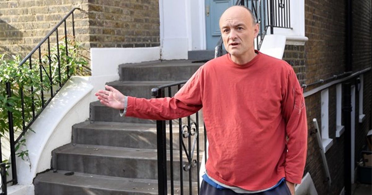
Post-Brexit, of course, we have your illuminating stint as eminence grise to Boris Johnson during the clusterfuck that was the UK’s response to the Covid pandemic. A period when draconian rules were imposed on the demos (rightly, in my view), with exemptions for a certain Boris Johnson (Partygate) and Dominic Cummings (Barnard Castle).
Norman Stone aside, it’s not clear what, if anything, you learned from any of these collaborators, so let’s examine some other potential influences. Here’s a short list of historical and present-day figures for whom you have expressed admiration: ancient Greek historian Thucydides, Dostoevsky, wartime Churchill aide Viscount Alanbrooke, Apollo programme engineer George Mueller, Manhattan Project mathematician John von Neumann, and Otto von Bismarck.
These were industrious men; men of vision, men of ambition, men of action. Men who got things done. Men, men, men, men, manly men, men, men. Men who were, for the most part, sceptical or even scornful of the concept of democracy and due process and who were, almost to a man, far more concerned with personal glory and the glory of the state than with the welfare of ordinary people.
I’ve said before that I’m not going to further deplete my Brexit-drained pockets by paying to wade through the Elliot Rodger-esque jeremiads on your Substack, but in your public pronouncements, you’ve dropped a few more clues about your view of the world.
In the early noughties, at the NFF, you spoke of the need to remove barriers to free trade and foreign capital (15 years before erecting the biggest barriers to trade the UK has seen in our lifetime) and of your desire to “drastically reduce the regulatory burden on businesses”.
You’ve repeatedly called for more “nimbleness” in government and management – as opposed to what we see from the “bloated”, “hidebound”, “stagnant”, “sclerotic”, “failing”, “moribund” civil service and EU; for the sort of dynamic, industrious taskforces of geniuses that gave us the atom bomb, the Apollo programme and Silicon Valley.
You have at least once complained that the UK has failed to exploit the opportunities arising from freedom from the EU, mirroring the myriad grumbles of other ardent Brexiters who moaned about us getting the “wrong sort of Brexit”.
And of all the world’s nations, the one that seems to be closest to where your heart should be is the United States. As well as fangirling over its technological achievements, you have on more than one occasion called for closer ties with our onetime colony, even if to the detriment of our relationship with our neighbours.
For someone who claims to be uncategorisable, there are some strong threads running through these names, bodies and statements. Low tax. Small state. Nationalism. A cavalier attitude to rules and regulations, and outright contempt for the common man.
It all seems to place you squarely in the same laissez-faire park as Ayn Rand, Friedrich Hayek, Milton Friedman and Liz Truss. The sort of people who would see Brexit as a gateway to their dream of creating “Singapore-on-Thames”; whose grand idea for governing is not to govern at all, but to entrust the future of the country to the philanthropy of CEOs and the benevolent wisdom of stock traders.
It’s extremely tempting to conclude that, for all your scruffy rebel trimmings, you’re just another neoliberal.
Disastrous capitalism
Neoliberalism, for those who didn’t glance at the news in 2022, is big-boy, max-strength, batshit capitalism. On crack. It’s about eliminating everything that could conceivably put a dent in profits; about maximising CEO bonuses and share payouts in the short term, and pretending the long term doesn’t exist. If too much tax is a bad thing, no tax must be best! If too many regulations stifle investment and innovation, then surely zero regulations is the answer!
But if neoliberalism is such an obviously terrific idea, Dom, how come it wasn’t universally adopted from the moment of its conception? One reason, really: it’s fucking terrible for 99% of the population.
Little ever trickles down. Without some sort of external rebalancing mechanism, such as that provided by the state or a body like the EU, it merely concentrates in an ever smaller number of hands. Millionaires hoard their millions until they’re billionaires, and our present-day billionaires are now laser-focused on hitting 13 figures.
Singapore has achieved its success only through eye-watering levels of immigration (40% of the labour force are foreign-born), which might have been a hard sell to most Brexit voters. The US, too, owes much of its prosperity to outsiders – the Manhattan Project team in particular was stuffed with surnames that most of your supporters wouldn’t dare try to pronounce.
And while America is undoubtedly the wealthiest nation on Earth, that wealth is enjoyed by a tiny fraction of Americans. The inequality there has reached levels not seen since 1910, contributing to violent crime rates higher than in any other developed country. Workers have few rights and next to no holidays, decent healthcare is unattainable by all but the gilded few, and as a consequence, life expectancy in the US is lower than in Panama and Albania and it’s battling with Belize for 24th spot in the World Happiness Index. (The UK is in 23rd, down from 14th in 2020. The Brexit bonuses just keep rolling in.)
Even if we did want to emulate that “success”, we’d have our work cut out, as the US has five times the population of the UK and 50 times the natural resources.
While no one would disagree that too much red tape is a bad thing, it wasn’t devised purely to annoy rightwingers. It actually has uses: safety considerations, antitrust, quality control, environmental protections, consumer choice. Following proper procedures also allows us to achieve widespread consensus for an idea (and no, I don’t mean the flimsy, fleeting sort of consensus you can whip up by pasting bollocks on the side of a bus) so that it can go ahead with proper resourcing and popular support.
Lower standards aren’t just an accidental by-product of deregulation – they’re the whole point, as Jacob Rees-Mogg witlessly let slip with his “good enough for India” comment to the Treasury Committee soon after Brexit.
Regulation conflagrations result in huge short-term gains for CEOs and traders … and market crashes, runaway inequality, and disasters like Grenfell and Bhopal and Deepwater Horizon and Boeing.
And while the lean, nimble, efficient taskforces you have such a hard-on for are great for achieving specific, limited goals, they’re not really the ideal vessels for tackling bigger, longer-term problems, like coordinating international efforts to reduce waste and pollution and deforestation, tackling mass migrations, mounting a response to a global pandemic, or, I dunno, maintaining peace in Europe.
(Interesting parallel here: you’ve proved yourself adept at assembling teams to achieve the specific short-term goal of smashing things up, and you maintained your 100% record with Brexit. But when it came to the real, hard, complex job of forging a post-Brexit future for Britain, you, and every other Brexit nutjob, have abjectly failed. Because that involves long-term thinking, long-term planning, innovation, imagination, research, consultation, and achieving a real, lasting consensus, and not many of the thinkers, planners, innovators and diplomats, having been on the other side of the argument, were lining up to help out.)
The implicit “right sort of Brexit”, of course, was “the Brexit we secretly wanted but never actually described in detail because if we had, you’d never have voted for it”. You can win a referendum with lies, but to then deliver the exact opposite of what was promised was a political impossibility even for Boris Johnson’s Tories.
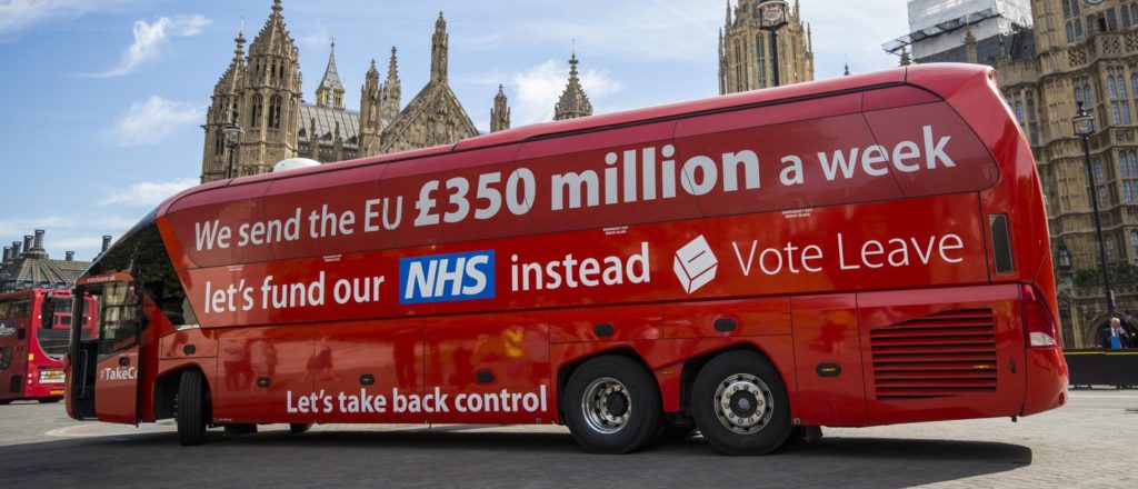
You’d sooner dress like a grown-up than admit it, but what most Brexit voters really wanted was BRINO – Brexit in name only. They wanted a win; they wanted their voices to be heard, to know their concerns were being acknowledged; but, aside from perhaps the genocide of all non-white folk, they didn’t actually want anything to change. If I had a pound for every time I’d heard some variation on the phrase “Stop panicking, there won’t be any downsides!”, the UK’s GDP would only be 3% lower because of Brexit instead of 4%.
Take this hilarious tractor twat, for example, who insisted that Brexit would make no difference, and that, at the same time, leaving the EU would somehow mean less red tape when trading with the EU.
False flag
But while I feel we’re edging closer to the truth here, I still don’t think the neoliberal dream was necessarily what you were chasing when you shoved the UK off the top floor of the Hotel Brussels without a crash mat.
For one thing, EU membership wasn’t really an obstacle to any of your stated goals. We’ve always been free to set up taskforces, to decide our own response to pandemics and suchlike, and besides, the UK had a disproportionate say in the laws that the EU drew up and passed. Being part of the bloc in many ways made innovation easier, as it gave us access to more funding and a deeper pool of talent.
Another reason I don’t think we’ve quite hit the nail on the head is that you know neoliberalism is not the answer. You’re a student of history and the classics and you’re up to speed with the news. (Hell, you were the news for a good few weeks.) You’re fully aware that a serially discredited ideology that’s been endlessly tried and tweaked and ended in tears for all but a few every time can’t possibly be the best path forward for Britain. Despite your stated desire for a meritocracy (government by the most deserving) and/or technocracy (government by the brightest), you know very well that populist methods only ever deliver kakistocracies (government by the worst): the likes of Boris Johnson, Donald Trump and Nigel Farage, the sort of lazy, narcissistic, self-serving scum described to a τ by the democrat/tyrants of Plato’s Republic.
But the main reason I don’t think you were acting in Britain’s best interests is that you hate your country.
You genuinely seem to believe the average IQ rises by 100% when you enter any room. You make no attempt to mask your disdain for your fellow man. Your political opponents, the media, the civil service, Tory politicians, even your direct collaborators: all are, in your jaded, bulging eyes, beneath you. And you hold the general public in such utter contempt that you blithely assumed they would swallow your outrageous referendum lies (52% of them duly obliged).
Why would anyone who regards literally all of his countrymen as blethering idiots ever devote so much time and effort to doing what’s best for his country?
Oh, and to return to the matter of your world-view, now that it’s all laid out before us, it rather puts one in mind of Mary Shelley, doesn’t it? A putrid pot-pourri of random elements in varying stages of decomposition, roughly stitched together, which seems like a reasonable idea on paper, but which, given life and released into the world, proves catastrophic.
Frankenstein never gave his creature a name either.