Statistricks, part 4: how they lie to you with graphs

Lie detector reading

Was the United Kingdom the fastest-growing economy in the G7, as Boris Johnson claimed? Of course it wasn’t. It was a Boris Johnson claim

Lie detector reading
Visual lies slip past our defences more easily than verbal ones.

Part 1: ‘Trade with the EU is declining’ (no, it isn’t)
Part 2: ‘We send the EU £350m a week’ (no, we don’t)
Part 3: Why are all polling companies run by Tories?

On February 5 2021, Andrew Neil, once respected political interviewer, pundit and chair of the Spectator Magazine Group, posted this tweet:

At a glance – which is all Neil is counting on you throwing at it – it really looks as though the Spectator is upping its game. Further examination, however, reveals that, as has become depressingly normal among those on the right, Neil is lying to you with statistics.

Check out the y-axes on those images. (For those you’ve forgotten their year-five maths, the x-axis is the horizontal line and the y-axis the vertical.) Notice anything odd? For one thing, they start at different values. Second, they’re plotted on different scales (the values for the Spectator are further apart). Why might that be?

Because if you plot them all on the same scale, the results paint a rather less flattering picture of the magazine’s fortunes:

At the end of the day, though, this is hardly novichokking a kindergarten, is it? It’s just rascally old Uncle Andy, cheekily tweaking the data to make his grubby little publication look a bit more appealing to prospective readers and advertisers.

But if that was all people were using these tricks for, I wouldn’t be writing this.

I started this series of posts because while people aren’t too bad at working out when they’re being lied to with words, our numbers game is a little less surefooted. And that seems to go double (= two times as much) for data presented in visual form: graphs, charts and tables, collectively known as graphics, or data vis.

Pictures and graphs lend an authority to data that words cannot. Our internal logic goes something like this: “Surely, if someone’s taken the trouble of researching, compiling and publishing a graph or a chart, they must know their stuff – and they must be telling the truth!”

Here’s the rebuttal to the first part of your thesis, internal logic:

As for the second part: truth doesn’t pay the bills (case in point: this blog). When people take great pains over something, there’s a distinct possibility that murkier motives are in play. Below are some examples to show you what I mean.

Quarter pounders

Until recently, you couldn’t move online for Tories excitedly parroting the news that the UK was the “fastest-growing economy in the G7”. (You’ll notice that not many of them are still flogging that particular horse. We’re about to see why.) But few of them bothered to include the data on which they were basing their claim.

The main problem with data visualisation is that it’s rarely possible to fit all the relevant data into your visualisation. Presenting numerical information inevitably involves making choices about what to include and what to leave out. If you want to illustrate the performance of the top 100 companies on the Financial Times Share Index in your newspaper, for example, you physically can’t represent every data point going back to its inception in 1984 without some sort of gatefold. So you go back as far as space will allow, and present what you hope is enough data to paint a meaningful picture. For share prices, such cherry-picking doesn’t matter so much. GDP figures are a different story.

Below is the data on which the Tories were basing their uplifting, Brexit’s-so-brilliant claim. And sure, in itself, it’s quite correct. A bigger gradient means a higher rate of growth, and on that metric, the UK really was leading the world.

But there are two problems with extrapolating this conclusion from this data. First, look at the actual values of those lines. The UK is bottom of the heap, both at the beginning and the end of the period. What this means is that the UK economy was faring worse, relative to its performance in 2017, than all its rivals (the widely accepted explanation for this is that the UK was hit the hardest economically by the pandemic, and was therefore recovering from a lower base. It was bound to be “fastest growing” at some point).

The second issue is that this is the smallest possible range of data. It shows us how the UK fared economically against comparable countries over a single quarter. Zooming out a bit, the picture looks rather different:

On the longer-term trend – which is the only trend that matters here – the UK’s performance is woeful. And why wouldn’t it be, with all those lovely trade barriers it’s thrown up with its nearest neighbours and biggest trading partners?

To interpret this graph as “the UK is the fastest-growing economy in the G7” is cherry-picking of the most outrageous order – straight up lying with figures – and yet practically no one ever calls it out.

Information dumped

In the next example, which was also shared with great enthusiasm by Tories in March 2022, once again, it’s not what the visual data is telling you, but what it isn’t, that’s significant.

Where’s that smell of roses coming from? Oh! Quelle surprise, it’s the UK again! What a world-beating nation it is!

The first thing that should set your Spidey sense tingling is the lack of any source on the graphic. (Turns out it was the Foreign, Commonwealth & Development Office, who posted this tweet, but when challenged, they declined to reveal their workings. The write-up of their exchange is worth a read.)

But once again, the most urgent problem is that we are missing crucial information. We have no idea what these figures represent as a percentage of the total Russian assets invested in those territories. If £1tn of Russian assets are invested in the UK economy, and only £40bn in the EU, then who is doing the better job on sanctions? (Definitive figures on the amount of Russian capital sloshing around the world are hard to come by, but the UK has long been oligarchs’ favourite spot to invest in property, and the bulk of Russian financial assets will inevitably have been parked in or near the City of London, the world’s leading financial centre.)

If you made a chart comparing how well-travelled Jason and Arthur are, showing that Jason has only been to France and Arthur has been to 50-plus countries, surely you’d think it apposite to mention that Jason is 14 and Arthur is 62?

Y, MIA

Once you’ve checked the bottom of a graphic for a source, and ascertained whether the x-axis is really as wide as it should be, the next place to look is at the y-axis. Does it start at zero? Why not?

Stolen from Ravi Parikh’s blog at Heap

If you tinker with the scale by selecting a narrow range of values, you can make differences appear as big or as small as you like.

Rotten Apple

In 2013, Apple CEO Tim Cook used the following graph as part of his presentation to mark the launch of the latest iPhone:

Tim-Cooking the books?

We’ve already seen that the omission of any units on an y-axis is a cardinal statistical sin. But that’s not all that’s off kilter here. Usually, when illustrating a company’s sales, you show the units sold in each time period. But this is a depiction of cumulative sales. Short of a mass product recall, cumulative sales never go down! Anyone armed with a jot of mathematical nous should spot that that decrease in gradient at the top right of the graph means sales are falling.

Chartjunk

Be wary of tables tarted up with bright colours, flashy fonts and pictorial elements. Yes, it might look more arresting, but it can also be harder to make sense of. The statistician, designer and artist Edward Tufte, one of the fathers of modern data visualisation, coined the term “data-ink ratio” to describe the proportion of a graphic that is essential to the communication of data. In his view, this should always be as close as possible to 1. The more bells and whistles a graphic has, the more sceptical you should be.

A common form of “chartjunk” is the use of images to illustrate the quantities involved.

According to the data in this graph, the amount of stupidity in Britain has doubled since 2015. To reflect this, the graphic designer (me) has made Daniel Hannan’s stupid head twice as tall at 2022 as it is at 2015. However, because images are two-dimensional, the second Hannan is actually four times as large as the first. The use of images here has created a misleading impression.

Porky pies

Even the humble pie chart is routinely mishandled. Here’s Fox News up to its perennial tricks:

Presumably, even some MAGA types are aware that the segments of a pie chart should add up to 100%. What Fox have probably done is ask a question and permitted multiple answers. The results of such questions should never be represented in pie-chart form; a bar chart would be more appropriate.

Some of the more ostentatious data designers like to show off their Photoshop skills with 3D pie charts that seem to leap out of the page. But while they’re more visually arresting than their 2D counterparts, they’re less useful for displaying information, because the perspective distorts the respective quantities, making the slices at the “front” appear bigger than they in fact are, and the slices at the “back” smaller.

Pretty patterns

Finally, just because two things are sitting together on a graph or chart, it doesn’t mean there is any relationship between them. You can plot anything against anything. Here’s just one example of researchers finding a correlation between two completely independent phenomena.

Even when there is a relationship, it doesn’t mean one thing is directly causing the other. Sometimes, a third, unmentioned force – known as a “confounding variable” – is at work.

It’s hard to see what role ice-cream consumption could play in the rate at which people drown, or vice versa. The true explanation for the relationship, of course, is the confounding variable of temperature. When it’s hot, people eat more ice-cream, and go swimming more often.

Similarly, a US study in the 1950s revealed that far more people were killed on the roads at 7pm than at 7am. “Goodness,” some wondered. “Why are there so many more bad drivers around in the evening than first thing in the morning?”

And the answer is: there are more drivers around in the evening than in the morning. The confounding variable here was simply the number of people on the road.

Apples and oranges

In the early 20th century, the US Navy launched a recruitment campaign based on the premise that serving in the navy was safer than being a civilian. And their statistics were sound: the death rate among serving naval officers was indeed lower than in the general populace.

The stumbling block in this case was that they were not comparing like with like. Sailors, almost without exception, are young and fit. The general populace, meanwhile, includes infants, old people and long-term sick people, all of whom (at least at that time) were far more likely to die than the average able seaman.

Graphic non-fiction v graphic novels

The watchwords for visual data, then, are pretty much the same as for verbal information: transparency, clarity, simplicity.

When deciding whether or not to trust visual data, your checklist should be as follows:

  • Source
  • Units
  • y-axis
  • Large range of values
  • Context: is there any other information, omitted from this visual element, that would be useful for a fuller understanding of the subject?

I’ll conclude this series soon with a round-up of all the other potential abuses of stats.

Statistricks, part 3: how they lie to you with polls

Opinion polls are way off with their predictions too often to be of any use. So why are they such big business?

Are you diving into the data, or is the data diving into you?

Part 1: ‘Trade with the EU is declining’ (no, it isn’t)
Part 2: ‘We send the EU £350m a week’ (no, we don’t)
Part 4: ‘The UK is the fastest-growing economy in the G7’ (no, it isn’t)

Not so long ago, you could go years without coming across a survey. A few folks were dimly aware of a company called Gallup, thanks to Top of the Pops, for which they compiled the charts, but otherwise polling companies were shy little leprechauns that only popped out once every four years to sound out the populace before each general election.

Now you’re lucky if you can go four minutes without seeing a snapshot of public opinion. Twitter polls, website polls, newspaper polls, polls by phone and email and WhatsApp; polls on everything from support for the death penalty to your preferred shade of toast.

What’s my tribe?

The appeal to us plebs is obvious. We can’t get enough of other people’s opinions, whether our response is to nod sagaciously or spit out our tea.

Interestingly, our egos are so devious, it doesn’t much matter whether most people agree with us or not. Because if, according to any given poll, ours is the majority view, we tend to sit back and smirk: “Well, naturally my opinion is the right opinion.” If, on the other hand, we’re in the minority, our response is usually “Gosh, I’m so clever, unlike all these sheep!”

Either way, polls are reassuring because they reinforce our place in the world. Our tribal, hierarchical nature, our teat-seeking need to belong, compels us to constantly reaffirm our sense of identity, and polls give us that in a neat package.

Views as news gets views

If polls are a novelty gift for the hoi polloi, they’re a godsend for newspapers, struggling as they are with dwindling resources, and for rolling news channels with endless airtime to fill. No time-consuming investigation, photography, writing or planning required – the pollsters take care of it all for free, right down to the covering press release with its own ready-made headline finding. And the public lap it up.

The pollsters, of course, are laughing all the way to the bank. Their services are in greater demand than ever before; the polling industry in the UK currently employs 42,500 people – four times as many as fishing.

So, surveys are win, win, win, right? People get entertainment, journos get clicks, pollsters get rich. What’s the problem? Because there’s always a problem with you, isn’t there, Bodle?

Blunt tools

As a matter of fact, there are two. The first is that polls are low-quality information.

Despite having been around for almost 200 years, and despite huge advances in methodology and technology, gauging popular opinion is still an inexact science. For proof, look no further than the wild differences between any two surveys carried out at the same time on the same issue.

In the week prior to the 2017 UK general election, for example, Scotland’s Herald newspaper had the Tories winning by 13%, while Wired predicted a 2% win for Labour. (In the event, May’s lot won by 2.5%; picking a figure somewhere in the middle of the outliers is usually a safeish bet.)  

The main headache for canvassers has always been choosing the right people to canvas. If you conducted a poll about general election voting intentions solely in Liverpool Walton, or took a snapshot of views on the likely longevity of the EU from 4,000 Daily Express readers (which the Express continues to do on a regular basis), then presented the results as a reflection of the national picture, you would rightly be laughed out of Pollville.

The key to a meaningful survey is to find a sample of people that is representative of the whole population. Your best hope of this is to make the sample as large as possible and as random as possible, for example by diversifying the means by which the poll is conducted (because market researchers wielding clipboards on the high street aren’t going to capture the sentiment of many office workers or the housebound, while online polls overlook the views of everyone without broadband), and sourcing participants from a wide area.

Even then, you have to legislate for the fact that pollees are, to a large degree, self-selecting. For one thing, people who are approached by pollsters must, ipso facto, be people who are easily contactable, whether in the flesh, by phone or online, which rules out a swathe of potentials; and for another, they’re likely to have more free time and less money (many polls still offer a fee).

Tories, trolls and tergiversators

Even if you do somehow manage to round up the perfect microcosm of humanity, there are further obstacles.

For one thing, people are unreliable. The “shy Tory factor” is well documented; people don’t always answer truthfully if they think their choice might be socially unacceptable. You can mitigate this problem somewhat by conducting your survey anonymously, which most pollsters now do.

Anonymity, however, only exacerbates a different problem. As anyone who has spent five minutes on social media will know, there are plenty of people around who just lie for kicks (or money). And if the questions aren’t being put to you in person, and your name isn’t at the top of the questionnaire, there’s even less pressure on you to tell the truth.

Furthermore, people don’t always know their own minds. If you’re faced with difficult questions in an area where your knowledge is sketchy, like trans rights or Northern Ireland, your honest answer to most questions would be “Don’t know”. But you’d feel dumb if you ticked “Don’t know” every time. Isn’t there a temptation to fake a little conviction?

And (Brexiters and Remainers notwithstanding), people’s opinions are not set in stone. Someone may genuinely be planning to vote Green when surveyed, then change their mind on the day.

Then there’s the issue of framing. Every facet of a survey, from its title to the introductory text, from the phrasing of the questions to the range of available answers, can unwittingly steer waverers towards certain choices.

Let’s say you want to study views on asylum seekers. If you ask 2,000 people “Do you agree that Britain should help families fleeing war and famine?”, you’re likely to get significantly different results than if you ask them, “Do you think Britain should allow in and pay for the upkeep of thousands of mostly young, mostly male, mostly Middle Eastern and African migrants?” (If this seems like an extreme example, I’ve seen some equally awful leading questions.)

Sometimes the questions don’t legislate for the full spectrum of possibilities. If no “don’t know” option is included, for example, people may be forced into expressing a preference that they don’t have.

Finally, the presentation of a poll’s results can make a huge difference. Few people have the patience to read through polls in their entirety, so what happens? Pollsters create a press release featuring the edited highlights – the highlights according to them.

When you consider all these pitfalls, suddenly it’s not so hard to see why pollsters’ predictions often fly so wide of the mark. But … so what if polls are inaccurate? They’re just a bit of fun!

This brings us to my second, more serious concern.

Market intelligence

While they’re passable diversions for punters and convenient space-fillers for papers and news channels, no one ever went on hunger strike to demand more polls. This constant drizzle of percentages and pie charts has not been delivered by popular demand. It’s a supply-side increase, driven by the people who really benefit from it.

Businesses live or die by their market research: the information they gather from the general populace. If you’re a food manufacturer launching a new bollock-shaped savoury snack, for example, it helps to know how many consumers are likely to buy it. But firms are also greatly dependent on their marketing – the information they send back into the community. And one of the best things they can do to promote their product is to generate the impression that by golly, people love Cheesicles!

We simply don’t have the time to do all the research required to formulate our own independent view on every imaginable issue. So what do we do? We take our cue from others: friends, or experts, or people we otherwise trust.

Hence the myriad adverts featuring glowing testimonials from chuffed customers. Hence celebrities being paid astronomical fees for sponsorship deals. Hence the very existence of “influencers”. Like it or not, our opinions are based, in large part, on other people’s opinions.

The only thing more likely to cause a stampede for Cheesicles than the endorsement of a random punter or celebrity is the endorsement of everyone. Why else would a certain pet food manufacturer spend 20-odd years telling everyone that eight out of 10 cats preferred it (until they were forced to water down their claim)? Aren’t you more tempted to give Squid Game a chance because everyone’s raving about it?

Even though some people quite like being classed among the minority – the brave rebels, the “counterculture” – those people are, ironically, in a minority. Most of us still feel safer sticking with the herd. So it’s in manufacturers’ interests to publish information that suggests their product is de rigueur.

(If you’re in doubt about the susceptibility of some people to third-party influence, look up the Solomon Asch line length test. As part of an experiment in 1951, test subjects – along with a number of paid plants – were shown visual diagrams of lines of different lengths and told to identify the longest one. The correct answer in each image was clear, but the stooges were briefed to vocally pick, and justify, the (same) wrong answer – and a surprisingly high proportion of the subjects changed their decision to match the wrong answer given by their peers. Later variations on the same study furnished less clear-cut results, but the phenomenon is real.)

And this is where all those flaws in polling methodology suddenly become friends. Polls can be inaccurate and misleading by accident – but they can also be misleading by design.

When businesses conduct a poll, they can (and have, and still do) use all the above loopholes to nudge the results in the “right” direction. They can select a skewed sample of people. They can select a meaninglessly small sample of people (still the most common tactic). They can ask leading questions, leave out inconvenient answers, present the results in a flattering way – or just conduct poll after poll after poll, discard the inconvenient results, and publish only those in which Cheesicles emerge triumphant.

Woop-de-doo, so businesses tell statistical white lies! Hardly front-page news, or the end of the world. If I’m duped into shelling out 75p for one bag of minging gorgonzola-flavoured corn gonads, well, I just won’t repeat my mistake.

True. But it’s a different story when the other main commissioners of polls play the same tricks.

Offices of state

It cannot have escaped your notice that the worlds of business and politics have been growing ever more closely intertwined. There’s now so much overlap of personnel between Downing Street, big business and the City (the incumbent chancellor, who arrived via Goldman Sachs and hedge funds, is just one of dozens of MPs and ministers with a background in finance), such astronomical sums pouring into the Tory party from industry barons, and so many Tories moonlighting as business consultants, that you might be forgiven for thinking that the two spheres had merged.

And as the association has deepened, so politicians (and other political operators like thinktanks and lobbying groups) have borrowed more tactics from their corporate pals. Public services are run like private enterprises; short-term profits and savings for the few are constantly prioritised over the long-term interests of the many; government communications departments have been transformed into slick, sleazy PR outfits. And one of the tools they’ve most warmly embraced is the poll.

While businesses carry out market research to gauge the viability of their products and services, political parties do so (largely through focus groups) to find out which policies and slogans will go down well. But whereas businesses only publicise polls to create the illusion of popularity, the practice has wider and scarier applications in the political sphere.

“Opinion polls are a device for influencing public opinion, not a device for measuring it. Crack that, and it all makes sense”

Peter Hitchens, The Broken Compass (2009)

Loath as I am to quote the aggressively self-aggrandizing Hitchens, on this occasion, he may have stumbled across a point. A number of studies (pdf) have looked into this phenomenon (pdf), and while the findings aren’t conclusive, they all point in the same direction: people can be swayed by opinion polls.

There are several mechanisms at play. First, if there’s a perception that one candidate in an election has an unassailable lead, some undecideds will back the likely winner, because they think the majority must be right (the “bandwagon effect”); a few will switch to backing the loser out of sympathy (the “underdog effect”); some of those who favoured the projected winner might not bother voting because it’s in the bag, while some of those who favoured one of the “doomed” candidates might give up for the same reason.

Conversely, if polls suggest a contest is close, turnout tends to increase. Even if your preferred candidate isn’t one of the two vying for top spot, you might be moved to vote tactically, to keep out the candidate you like least.

Polling also has an indirect effect via the media. When surveys are reporting good figures for a candidate, broadcasters and publishers tend to give them more airtime and column inches, thus increasing their exposure, and, consequently, their popularity.

However these effects ultimately balance out, it’s clear that the ability to manipulate polling information could give you enormous political power. “But that’s absurd!” you cry. “I’ve never had my mind changed by anything as frivolous as a poll!”

Really? Can you be absolutely sure of that? Even if you’re immune, can’t lesser mortals be affected? If it works in the advertising world, there’s no reason why shouldn’t it work in the political sphere.

You might object at this point that pollsters are legitimate enterprises that have nothing to gain from putting out false information. To which I would counter-object: polling companies are businesses too. They exist not as some sort of public service, but to make money for their clients. And their clients’ interests do not always align with the public good.

A brief look at the ownership and management of the pollsters does little to alleviate these fears.

Savanta ComRes (formerly ComRes)

Retained pollster for ITV and the Daily Mail. Founded by Andrew Hawkins, Christian Conservative and contributor to the Daily Telegraph with a clear pro-Brexit stance. This year, Hawkins launched DemocracyThree, a “campaigning platform” that helps businesses and other interest groups raise funds and build support – ie influence public opinion.

“Democracy 3.0 helps you build a support base, raise the funds you need for your campaign to take off, and then we work with you to appoint professional campaigners – such as lobbyists and PR experts – who can bring your campaign to life.”

DemocracyThree website

ICM

Co-founded in 1989 by Nick Sparrow, a fundraising consultant who worked as a private pollster for the Tories from 1995-2004. Now part of “human understanding agency” Walnut Unlimited, which is in turn part of UNLIMITED – a “fully integrated agency group with human understanding at the heart”.

The sales pitches for these firms include the following quotes:

“Our team are experts in public opinion, behavioural change, communication, consultation and participation, policy and strategy, reputation, and user experience.”

ICM website

“We help brands connect with people, by understanding people … Blending neuroscience, behavioural science and data science, we uncover the truth behind our human experiences … Our mission is to create genuine business advantage for clients … by uncovering behaviour-led insights from our Human Understanding Lab.”

Walnut Unlimited website

Populus

Official pollster for the Times newspaper, co-founded by Tory peer Andrew Cooper and Michael Simmonds, a former adviser to the Tory party now married to Tory MP Nick Gibb, who has recently been added to the interview panel to choose the next head of media regulator Ofcom

YouGov

Founded by Nadhim Zadawi, the incumbent Tory health secretary, and Stephan Shakespeare, former owner of the ConservativeHome website and former associate of diehard Brexiters Iain Dale, Tim Montgomerie and Claire Fox.

Survation

Founded by Damian Lyons Lowe, who during the EU referendum campaign set up, at the request of Ukip’s Nigel Farage, a separate “polling” company, Constituency Polling Ltd, based in the Bristol office of Arron Banks’s Eldon Insurance. But its remit seems to have been less about asking questions and more about micro-targeting voters. “Interviews with several people familiar with Survation’s operations show that in addition to measuring public opinion, the firm’s executives also helped shape it.”

(I was unable to find any evidence of strong political affiliation among the leadership of Ipsos MORI or Qriously, and Kantar has changed ownership and CEO so frequently of late as for any such investigation to be meaningless. As a side note, there seems to have been a recent flurry of activity in this sector, with many companies being gobbled up into ever larger, faceless global marketing conglomerates, whale sharks hoovering up data, with ever more sinister specialisms: “consumer insights”, “market intelligence”, “human understanding”.)

I don’t know about you, but I’d expect the people who founded and run companies that were nominally about gathering and analysing data to be statistics nerds – people with an interest in objective truth – not, by an overwhelming majority, people with the same strong political leanings. Put it this way: CEOs of polling firms have final approval over which surveys are released. If you were married to a Tory MP, would you really sign off on a poll that was damaging to your husband’s party?

Someone of a more cynical bent might start wondering whether the hard right, having secured control of most of the UK’s print media and with its tendrils burrowing ever deeper into the BBC, was stealthily trying to establish a monopoly on data.  

So maybe they’re not all angels. But surely they can’t just pump rubbish into the public domain willy-nilly? In a stable(ish) 21st-century democracy like Britain, there must be checks and balances in place.

Well, here’s the thing. Businesses are prevented from publishing grossly misleading adverts by the Advertising Standards Authority, but there’s no such independent regulator for the polling industry. They police themselves, through a voluntary body called the British Polling Council, staffed entirely by industry members.

So, polls are bad information, they can influence people’s votes, the pollsters’ motives are questionable, and they’re accountable to no one. But what about journalists? Isn’t it their job to pick up on this sort of thing?

It is, but as I mentioned above, journalistic resources are so depleted now, and the pressure to get stories up fast so great, that they can ill afford to look gift stories in the mouth. And as I mentioned in my last post, journalism and broadcasting aren’t exactly brimming with Carol Vordermans. Even if they had the time and the inclination to carry out due diligence, they wouldn’t necessarily know how.

The bald fact is, when you look at a poll, whether it’s reached you through a newspaper, a website, a meme or a leaflet, you have no guarantee whatsoever that it’s been subjected to even rudimentary checks.

What can we do?

Surveys are – or were, originally – designed to present a snapshot of the popular mood. But even the most fair-minded, honourably intentioned, statistically savvy pollster, using the best possible methodology, can produce a poll that is complete and utter Cheesicles.

But judging by the vast amounts of money pouring into the industry, the political leanings of its ownership and management, and their alarming transformation from simple question-setters to behavioural change specialists, there’s a very real possibility that honourable intentions are an endangered species in the polling industry.

Polls aren’t going away any time soon. Businesses and politicos will always want to gauge which way the wind is blowing. But when it comes to the data they’re pumping back in the public domain – a tiny fraction of what they’re amassing – the rest of us don’t have to play along.

To journalists, I would say: please stop treating polls as an easy way of filling column inches. (Employees of the Daily Express, Mail, Sun and Telegraph, I’m not talking to you. I said “journalists”.)

This is the opposite of speaking truth to power; it’s speaking garbage to those who aren’t in power. It’s 1980s women’s magazine journalism, clickbait, guff, and you’ve repeatedly proven yourselves incapable of discerning good information from bad.

If you must run an article on a poll, then ensure that, at the very minimum, you ask, and get satisfactory answers to, these questions:

  • Who commissioned the poll?
  • Who carried out the poll?
  • What was the sample size? If it’s much less than 2,000 people, ignore it.
  • What’s the relative standard error? (A measure of the confidence in the accuracy of the survey. If Labour are leading the Tories in a poll by 36% to 35% and the RSE is over 2% – as it is on samples of less than 2,000 – then they may not be leading at all.)
  • What were the questions?
  • What was the methodology?

Then, when you publish the story, include all this information so that readers can draw their own conclusions about the poll’s reliability. Above all, include a link to the poll. If you don’t take all these steps, your story is worthless.

To the public, my advice would be: ignore polls. If you must read them, treat them as meaningless fun, fodder for a throwaway social media gag, and don’t for one second fall into the trap of thinking they’re conveying any sort of truth.

If you’re ever approached to participate in a poll, ask yourself: do you really want to be handing over your data to people who are likely to be using that data against you and enriching themselves in the process?

Finally, to the pollsters, I would say: we’ve got your number. 

How they lie with statistics, part 2: the value of nothing

Johnson playing tennis

The point was never whether EU membership cost £350m, £150m or a fiver a week. The question should have been: what does that buy us?

Numbers racquet: anyone for a £160,000 game of tennis with a former Russian minister’s wife?

Part 1: ‘Trade with the EU is declining’ (no, it isn’t)
Part 3: Why are all polling companies run by Tories?
Part 4: ‘The UK is the fastest-growing economy in the G7’ (no, it isn’t)

Here’s a thought experiment. Picture a woman who’s two metres tall (about 6ft 6in). Easy, right? Now picture a second woman, standing next to the first, who is a millon times taller: 2 million metres, or 2,000km, tall. I guarantee you the giant you’re imagining is no more than 100 times the size of her neighbour.

Try approaching it another way. Say the six-foot woman launches a rocket, which travels straight upwards at 100mph (about the average speed of the space shuttle for the first minute after take-off). How long do you think you will have to keep mentally following that rocket before it draws level with the giant’s head? The answer is 12 and a half hours.

All of which is a rather long-winded way of showing that human brains are rubbish at processing large quantities. If everyday numbers cause a mental power cut in most of us, big numbers trigger a full-on meltdown. 

“The crooks already know these tricks. Honest men must learn them in self-defence”

Darrell Huff, How To Lie With Statistics (1954)

‘We send the EU £350m a week’

No examination of number abuses would be complete without a look at the granddaddy of them all: the slogan that, along with “Take back control”, arguably swung the EU referendum for Leave.

On one level, of course, it was just another example of populists making shit up. The true EU membership fee, after the UK received its rebate, was probably at most half that sum (Vote Leave’s Skid Row Svengali Dominic Cummings admitted in a letter dated April 2016 to Sir Andrew Dilnot of the UK Statistics Authority that “£237m per week was the net level of resources being transferred from the UK as a whole to the EU”) (pdf).

But the arguably more interesting point is why he chose this line of attack in the first place.

The following Twitter exchange from a couple of months ago (I failed to screenshot before the inevitable block came) is enlightening.

“We’ll save £350m a week by leaving the EU!”
“No, we won’t. The figure on the bus was a lie. The true cost of membership is about half that.”
“Well, £175m still sounds like a lot of money!”

Wait. So £350m a week is too much … and a 50% discount on that is still too much? What’s a reasonable amount then?

This is what Cummings and co were bargaining on. They knew the exact sums involved were immaterial; all that mattered was the emotional impact of the big number. “Eek, seven zeroes!” Critical faculties switched off, job done.

(Meanwhile, the other prong of Cummings’ propaganda assault – Turkey – was designed with similar intent: “Eek, brown people!” Primal fear of The Other evoked, rational brain bypassed, job done.)

Some of us identified the flaw fairly quickly. If I arrived in the pub and told you breathlessly that I’d just spent one thousand pounds, you might raise an eyebrow, but you’d probably reserve your final judgment pending further information. Namely, what did I spend it on? A house, a car, a watch, a hat, or a packet of crisps?

A moment’s reflection, which is apparently more than 52% of the electorate could spare, would tell you that the statement Quantity X costs a lot of money is meaningless in isolation. Before you can judge whether that expenditure is a good idea, you need answers to the following questions:

  1. Can the buyer afford it? What is this sum as a proportion of their budget?
  2. What do comparable items or services cost?
  3. Is it a reasonable rate? Are others being charged a similar amount?
  4. How much will it cost to get out of the contract?
  5. What exactly is the buyer getting for their investment? Does it represents good value for money? Can the same or better goods and services be obtained elsewhere, for less outlay?

“They said how much money we would save [by leaving the EU], but they didn’t say how much we would lose”

Rueful Brexit-voting ex-miner from Sunderland, speaking to Financial Times journalist

Let’s tackle those points one by one.

1) The UK’s EU contributions for the financial year to April 2020, minus rebate and EU funds received, came to £7.7bn. Total government spending for the same period is predicted to turn out a shade north of £900bn. So as a proportion of the UK’s overall spending, EU membership cost less than 1%. If you’re a taxpayer earning £30,000 pa, that means you’re paying about £43.53 a year towards the cost of EU membership, or just over a quarter of the TV licence fee. Does £150m a week (£7.7bn/52) feel so enormous now?

2) To put that £7.7bn in perspective, the government spends around £190bn a year on pensions (“We send economically unproductive old people £3.7bn a week. Let’s fund our NHS instead”), £170bn on the NHS, £110bn on education, £43bn on defence, £15bn on civil service pay, £600m on running the House of Commons and the Lords, including £225m on MPs’ and Lords’ salaries and allowances, £67m on the royal family, and £80m on the Department for Exiting the EU. (Specific, up-to-date figures are not available for all these areas, particularly when it comes to the murky warrens of government, so I’m doing some approximating here, but they’re all in the right ballpark.)

To round off with a couple of other large-scale operations, the international aid budget stood at around £15bn a year (until the Tories slashed it), the BBC’s annual spend is around £4bn year, and membership of the United Nations and the World Health Organization sets the country back £100m and £10m a year respectively.

Does £150m a week feel so enormous now?

3) You’ll often hear Brexiters complaining that “the UK is the biggest contributor to the EU”. Again, that’s not true; Germany, France and Italy all pay more. Moreover, there’s a good reason why Britain chips in more than most, which is that Britain is one of the most populous and richest countries in the EU. If you work out the contribution per head, ie, divide the fee between us, the UK is bang in the middle of the field. Norway, which isn’t even a full member of the EU and has no say in passing its laws, pays in more per person than the UK does.

Besides, in most societies, taxation is organised such that richer people pay more than poorer people. It’s hardly crazy to suggest that the same logic should apply to economic blocs.

Does £150m a week feel so enormous now?

4) Calculating the economic cost of extricating Britain from the EU is fiendishly complex, because it touches on so many areas of government, business and personal life, so many of the costs are yet to be borne, and we can’t know for sure how things would have panned out if we’d stayed. But if we’re lacking all the pieces of the jigsaw, we have enough side and corner segments to give us an approximate idea of its size.

The costs come in the form of costs to the government, to businesses and to citizens, but since the government is funded by taxpayers and businesses have little choice but to pass on most costs to customers and employees, they will all, ultimately, be borne by you and me.

(There’s bound to be a bit of double-counting going on here, but I strongly doubt whether that will amount to more than the stuff I’ve missed. Speaking of which, if you’re knowledgeable in this field and you find anything missing or startlingly amiss, please point it out – politely – in the comments, and I will amend ASAP.)

Costs to government

Holding referendum: £130m

Government information campaigns: £50m on Get Ready For Brexit in October 2019; £93m on Get Ready 2: Check, Change, Go, from July 2020

New customs infrastructure to monitor trade: £700m

No-deal Brexit agreement with ferry company that had no ferries: £87m

Consultancy fees: £150m

Paying 27,500 extra civil servants to plan and execute Brexit-related changes: £825m a year (conservatively assuming a salary of £30,000 per civil servant) (plus recruitment costs, benefits, pensions)

Assistance to exporters in training and hiring 50,000 customs officers: £84m

Festival of Brexit: £120m

Extension of Fujitsu contract to service old customs system: £12m

Building 29 lorry parks to hold lorries without correct paperwork: no hard figures yet available because work is ongoing, but the town of Warrington alone received has £800,000 from the government just to help with the costs of running them.

By the end of 2021, the government estimates that it will have spent £8.1bn just on making Brexit happen. And the haemorrhaging of cash isn’t magically going to stop then; businesses will still need support, negotiations for a new trading relationship with the EU will need to continue, and the government will likely have a lot of expensive court cases to fight.

Costs to business

Re-registering all UK-produced chemicals under new licences: £1bn (one-off)

Processing new customs paperwork: £7bn per year (including, I assume, the salaries of the abovementioned customs officers)

Extra admin, traffic delays and lorry parks for haulage and freight firms: £15bn per year

New customs declarations: £17bn-£20bn a year

Costs to you and me

(These will of course vary from person to person, depending on your lifestyles and life choices.)

  • Travel visas
  • Health insurance
  • Mobile roaming charges
  • Credit card charges abroad
  • Kennelling fees, as pet passporting now defunct
  • Higher prices abroad due to lower value of sterling
  • Fall in value of pensions due to lower value of sterling
  • Rise in prices of imported food and other goods due to lower value of sterling
  • Reduction in portion sizes (loss of value)

Plus, of course, the loss of our freedom to live, study, work and retire in 31 countries, which to my mind is incalculable.

Finally, falling upon the nation as a whole is a hotchpotch of unknown and unquantifiable losses, which while impossible to nail down exactly, will without doubt all be sizeable negatives: the talented immigrants put off from coming to the UK; shortages of labour, skilled and unskilled; the brain drain of EU citizens and disillusioned Remainers leaving because of Brexit; the effect on the mental health of millions; the dire consequences for the economy of having a fanatical, incompetent, mendacious, anti-intellectual far-right government in charge; the social costs of a divided and disinformed citizenry; all the governmental, parliamentary and civil service time wasted on Brexit; the value of EU laws on workers’ rights, the environment, and health and safety; the huge blow to Britain’s global reputation and soft power.

All these factors feed into probably the best indicator of a country’s material wealth: its gross domestic product (GDP). When a country is spending so much time and energy on negotiations, and unnecessary infrastructure, and form-filling, and stuck in queues of lorries, it has less time and energy to make things. Meanwhile, tariffs and non-tariff barriers never fail to reduce the volume of trade.

Estimates of the long-term hit to the UK’s GDP vary from 2% to 9%, with only Patrick Minford’s discredited Economists for Europe group predicting any improvement, and that at the cost of the UK’s manufacturing industries. Two per cent of GDP is £42bn per year. Nine per cent is £189bn.

Does £150m a week, or £8bn a year, feel so enormous now?

5) Now to the crunch question. What did the UK get for its money? Even if not everything about the EU was desirable, some of it was clearly worth having, or the UK and every other member state would have quit long ago. Can all these bounties be sourced elsewhere? If so, at what price?

Here’s a list (far from exhaustive – again, please pipe up with any glaring omissions) of some of the basic, and not so basic, functions and programmes provided by the EU.

Frictionless trade, frictionless travel, trade negotiations, Horizon 2020, Natura 2000, Marie Curie programme, EHIC, Erasmus education programme, Erasmus+ sports programme, Galileo, Euratom, European Arrest Warrant, European Medicines Agency, European Banking Agency, European Youth Orchestra, regional development funds, research grants, pet passports …

Some of this is plain irreplaceable. The UK has already given up on developing its own alternative to Galileo, because it has neither the money nor the expertise. Erasmus and Erasmus+ are dead and gone, with only the spectre of a promise of a … UK-only version to succeed it. And if we want to be part of Euratom and the European Arrest Warrant again, we’ll just have to swallow our pride, beg for acceptance, and pay, doubtless over the odds, for the privilege.

Some is replaceable, but under the Tories, highly unlikely to be replaced. The government is going to give Cornwall a measly 5% of the funding it received from the EU, in breach (naturally) of its promise to match the sum in full.

Instead of a plaintive whine of “Lies!”, the Remain campaign’s response to the Bus of Bollocks should have been a bigger bus (Megabus? MAGAbus?) emblazoned with the slogan “£150m a week? Less than 1% of GDP? For all this? Bargain!”, and a word cloud listing all the positives of membership listed above.

Not as catchy, of course, but unfortunately for the good guys, the truth rarely is.

  • Next time: I dunno, probably something about surveys and comparing apples and oranges.

Statistricks: how they lie to you with numbers (part 1)

If we’re going to fight back against the populists’ calculated assault on truth, we need to raise our numbers game
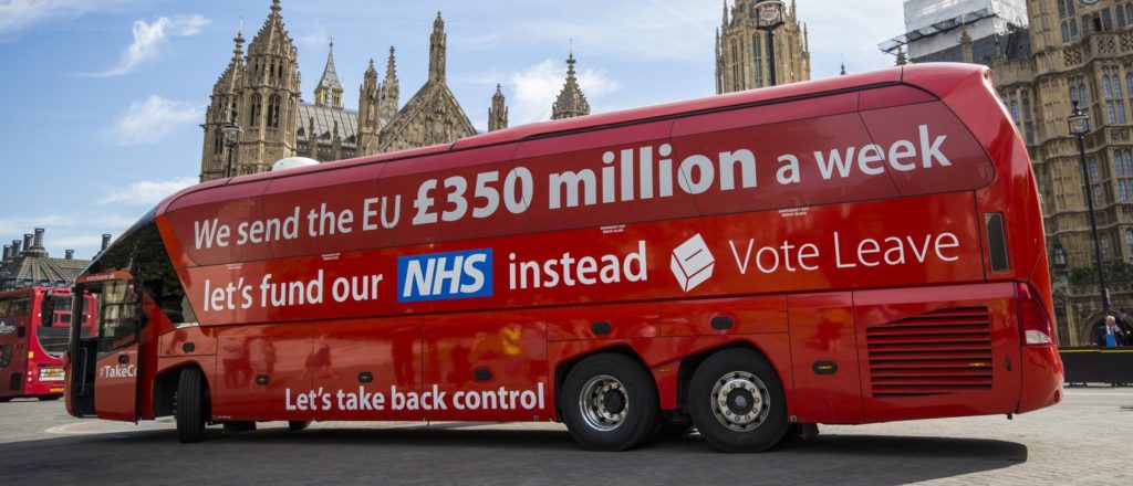
Part 2: ‘We send the EU £350m a week’ (no, we don’t)
Part 3: Why are all polling companies run by Tories?
Part 4: ‘The UK is the fastest-growing economy in the G7’ (no, it isn’t)

Maths is scary.

There are plenty of maths wizzes out there, of course, and most of us, when the necessity arises, can perform basic calculations. It’s just that these operations don’t come naturally to human beings. For most of our species’ history, there was little need for any more mental arithmetic than “one/two/many” and “our tribe small, their tribe big”.

If your brain isn’t adequately trained, maths requires serious mental effort, which most of us will go to any lengths to avoid. As a result, when confronted with a differential equation or trigonometry problem, we curl into a ball and whimper, “Oh, I’m rubbish with numbers!”

So when it comes to statistics, just as with molecular biology and nuclear physics and translating ancient Phoenician, we tend to leave things to the experts. The catch is, the main conduits of this knowledge from professors to public – the media – are as clueless about maths as we are.

As a veteran of journalism of 25 years, I can let you in on a scary secret: reporters – even reporters who are specifically charged with writing about business and science and trade – rarely have any sort of background in maths or economics. Most of those who aren’t media studies or journalism graduates studied humanities (English, modern languages, history, politics, law), and the same goes for the subeditors and desk editors whose job it is to check their work. In the average newspaper office, you can count on the fingers of one hand the number of people who tell an x-axis from a y-axis, a percentage point from a percentage or a median from a mean. And TV interviewers, judging by their performance before and since Brexit, are no better.

Most of us aren’t too bad at figuring out when people are trying to mislead us with words or facts or pictures. But because we’re useless with numbers – and the gatekeepers are too – we’re much more susceptible to numerical shenanigans. Statistics can be massaged, manipulated, misrepresented and murdered as easily as words can. And it is this human weakness that the populists are counting on.

What I want to try to do in the next few posts is look at some of the more common examples of statistical chicanery that you will come across, in the hope that at least a few more people can start calling out the bastards who are trying to rip our society apart. (If I miss any obvious ones, please add your suggestions in the comments.)

(If you have no time to read on, I beg you to consider buying or borrowing a copy of Anthony Reuben’s Statistical: Ten Easy Ways To Avoid Being Misled By Numbers (Constable, 2019). It’s clear and concise and bang up to date, covering Brexit and Trump (but not coronavirus), and an easy read even for the fraidiest maths-phobe.)

The truth, the half-truth, and nothing like the truth

Sometimes, of course, as our present government demonstrates on a daily basis, populists are perfectly happy to forsake real numbers for entirely imaginary ones.

Think Owen Paterson’s assertion that only 5% of Northern Ireland’s trade is with Ireland, when the true figure is at least 30%; Jacob Rees-Mogg merrily retweeting the Sun’s innumerate bollocks about how much cheaper your shopping basket will be after Brexit; Dominic Raab overstating the cost of the CAP to British agriculture by a factor of 1,600%; Daniel Kawczynski’s ludicrous lemons claim; Matt Hancock counting pairs of gloves as two individual items of PPE; Matt Hancock including coronavirus tests on the same person and testing kits put in the post in the 100,000 total of tests carried out; Matt Hancock counting nurses who haven’t left towards the total of extra nurses employed; Boris Johnson, and thus, subsequently, the entire Conservative party, repeating until blue in the face that the Tories are building 40 new hospitals, when in fact they have committed to only six; Boris Johnson’s claim in January 2020 that the economy had grown by 73% under the present Tory government, when in fact the data covers the period back to 1990, which includes 13 years of Labour; Boris Johnson’s brazen and still unretracted claim that there are 400,000 fewer families in poverty since the Tories came to power, when in truth there are 600,000 more.

The chief drawback of straight-up untruths, of course, is that they’re easy to check and challenge. Most of the fictions above were exposed as such fairly quickly (though not before they’d burrowed their way into a few million poorly guarded minds). A far more effective way of misleading people is to present numerical information that is not incorrect, per se, but which tells only part of the story. To offer up, if you like, a fractional truth.

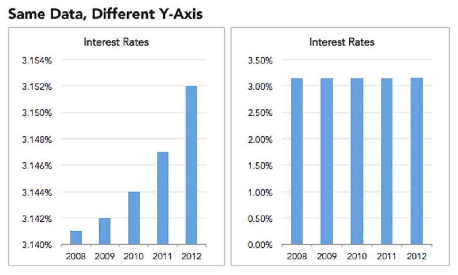
11/10 for presentation

If you’ve ever used a dating app, chances are you didn’t upload as your profile picture that zitty red-eye selfie you took in the Primark fitting room. You hunted through old snaps, maybe asked a camera-handy friend over for a mini-shoot, possibly even added a flattering filter, did a bit of Photoshopping, and judiciously cropped out the boyfriend. In short, you went to reasonable (or extreme) lengths to paint yourself in the best possible light.

This process – statisticians call it “cherry-picking”, but I prefer “Instagramming” – is the populists’ most common way of abusing numbers (it can also be applied in reverse, to show something in its worst possible light). If the absolute figure (say, 17.4 million) is the most impressive, use that. If the percentage best advances your case, use that (but if it’s, say, only 51.9%, poof! It’s gone). If neither of those works to your advantage, what about the trend?

Which brings us to our first example.

‘Trade with the EU is declining’

OMG! Trade with the EU is declining?! Tomorrow, our trade with them will be nothing! We must end all commerce with them now!

That’s clearly the reaction this claim was designed to elicit, and there were enough people lacking either the ability or the inclination to check it that it succeeded in its goal.

While it wasn’t one of the primary arguments advanced by the Leave campaign, it’s a drum that rightwing politicians, commentators and newspapers have been beating since day one. It was also one of the central planks of the “failing EU” narrative, which you still hear to this day.

Still, if the UK’s trade with the EU is shrinking, surely it’s a point worth making?

The first problem here is that the statement is not true. UK trade with the EU has grown steadily since we joined, as even House of Commons figures show:

(I couldn’t find an HoC graph covering the whole period, but the figures are all out there.)

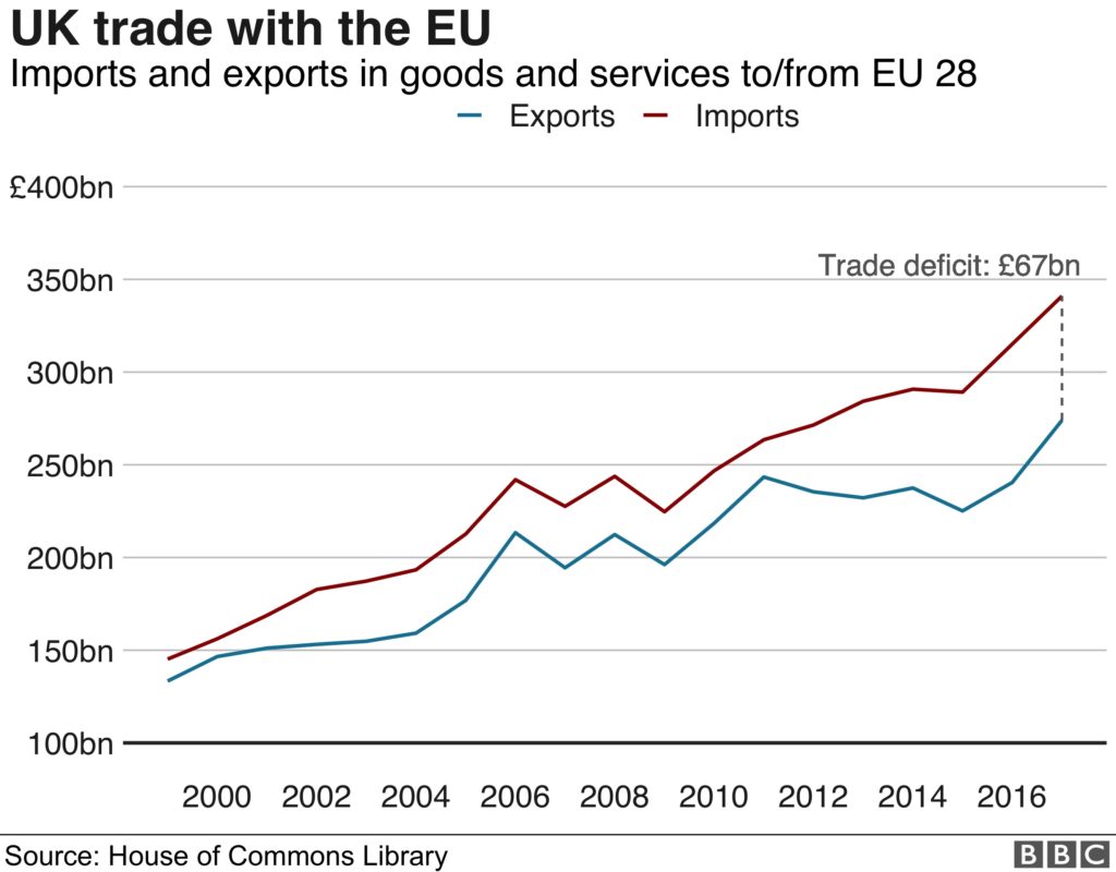
Which shouldn’t come as a colossal surprise, as these are our closest neighbours, with whom we have enjoyed ever closer ties for almost 50 years. Of course trade with them is always going to grow.

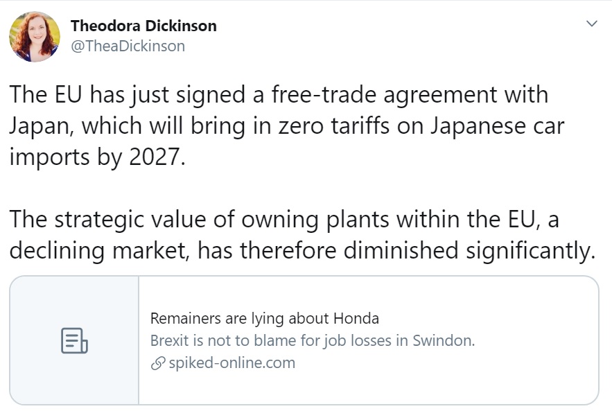
So what is Thickinson wittering on about? It turns out what she meant is that the UK’s trade with the EU as a proportion of its overall trade has been decreasing (slowly) since 2000. Trade with the EU is still growing, but trade with other countries is growing faster.

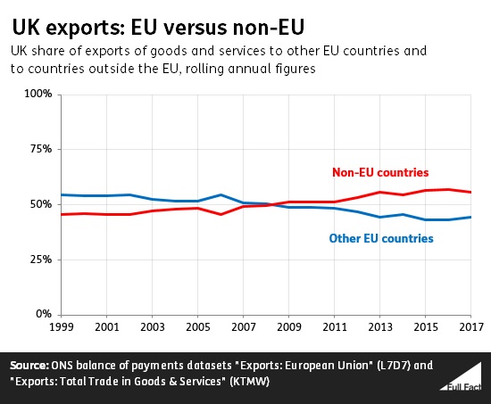
(The trend was bucked in 2019, when the share rose to 46%, which is why they bit their tongues on this one for a while.)

So, not exactly a precipitous decline, but if trade with the EU as a proportion of overall trade is shrinking, shouldn’t we be a little worried?

Well, no, for two reasons.

First, trade outside the EU has increased precisely because of EU trade agreements with other countries and blocs, such as Israel, Egypt, South Africa, Canada, Mercosur and South Korea. In other words, trade with the EU has (proportionally) fallen because of trade through the EU. (For the benefit of those who have been living under a rock for five years, the UK will cease to be a signatory to all those deals as well as its EU agreements from January 1 2021. Sure, we might renegotiate some after exit, but there’s no guarantee of that, and even if we succeed, they’ll almost certainly be on less favourable terms, as the UK now has a lot less negotiating clout than it did as part of a bloc of 510 million people.)

Second, the countries with which the UK’s trade is growing more quickly are on the whole much smaller; they are developing countries. Trade with developed nations, and with nations with which trade relations are already well established – such as those in the EU – is never going to grow particularly fast, because it’s all grown up already.

Let’s take, as a hypothetical example, the nation of Arsendia. If you were to tell me that trade with Arsendia had increased by 1,000% over the past year, while trade with the EU 27 had grown by only 0.2%, I’d think, “Whoa! Maybe Arsendia is the future!” But if I then discovered the somewhat relevant supplementary information that trade with Arsendia this year was worth £110, compared with £10 in 2018-19, while the value of trade with the EU stood at £668bn, I might come to a slightly different conclusion.

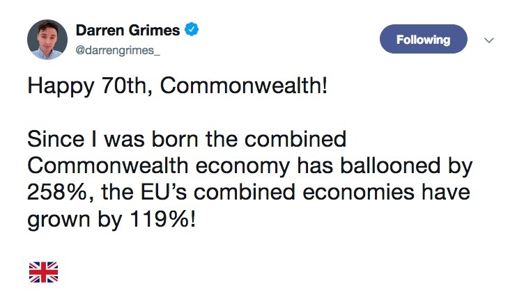
To take a real-world example often cited by Brexiters, over the last 20 years, trade with Commonwealth nations has increased by a factor of more than three.

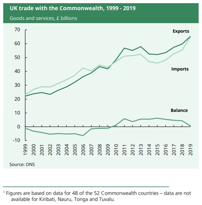
Meanwhile, over the same period, the value of UK trade with EU countries has merely doubled.

But now look at the absolute figures. Exports to the EU in 2019 were worth £300bn (43% of the UK total), and imports from it £372bn (51%). Meanwhile, UK exports to all the Commonwealth nations combined in 2019 were worth £65.2bn, while imports from those countries had a total value of £64.5bn. That’s less than a fifth of the EU total.

Again, pretty much what you’d expect when countries tend to do most of their trade with their neighbours, and most Commonwealth countries are half the fucking world away.

Adversely comparing the rate of growth of trade with established trade partners with the rate of growth of trade with tiny, brand-new buddies is the equivalent of a father taking a tape measure to his 18-year-old son and 14-year-old daughter, then saying, “Sorry, Kev, but Lisa’s grown three inches this year and you’ve barely sprouted at all, so I’m afraid she gets all the attention now.”

This is a common statistical misapprehension called the base rate fallacy, or ignoring the baseline. Expect it to make a reappearance, as it is one of the populists’ favourite subterfuges.

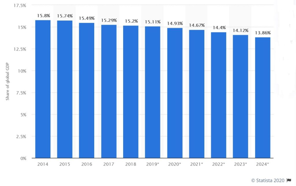
(The United States’ share of global GDP is declining for the exact same reason – less developed nations are eating up the pie because they have more scope to expand quickly – but you won’t find any of the Brexit zealots shouting about that.)

Let’s try to boil this down into something so simple that even the average Tory MP can understand it. Trade with the EU is growing. Trade with some other, much smaller countries is growing a little faster, because they have more capacity for growth, but that’s unlikely to continue for long. The EU, the UK’s closest neighbour, is, and will always remain, the UK’s most important trading partner.

A recurring theme of these posts is going to be: whenever you see pat statistical statements like Dickinson’s, by politician or commentator or journalist, they are not giving you the full picture. It’s not necessarily their fault – there isn’t enough space. But the space shortage gives them an excuse to Instagram the data; to present only the facets of the information that best supports their agenda.

For a full understanding of the situation, you need to a) read beyond the headline or tweet, and ideally trace the source of the data; b) do further research, or at least read some rebuttals; and if neither of those is possible, c) ask questions. In the particular case of “Trade with the EU is declining’”, the relevant questions would be: “What level is it declining from?”, “How fast?”, and “Is this trend likely to continue?”

As we’ll see time and again in the coming posts, without the proper context, numerical information is useless. However great the emotional impact on you, you must not draw any conclusions until you see the wider picture. If you can’t overcome your fear of numbers, you must at least stop meekly accepting them.

Next time: let’s fund the NHS instead!