
• Part 1: ‘Trade with the EU is declining’ (no, it isn’t)
• Part 2: ‘We send the EU £350m a week’ (no, we don’t)
• Part 3: Why are all polling companies run by Tories?
On February 5 2021, Andrew Neil, once respected political interviewer, pundit and chair of the Spectator Magazine Group, posted this tweet:
At a glance – which is all Neil is counting on you throwing at it – it really looks as though the Spectator is upping its game. Further examination, however, reveals that, as has become depressingly normal among those on the right, Neil is lying to you with statistics.
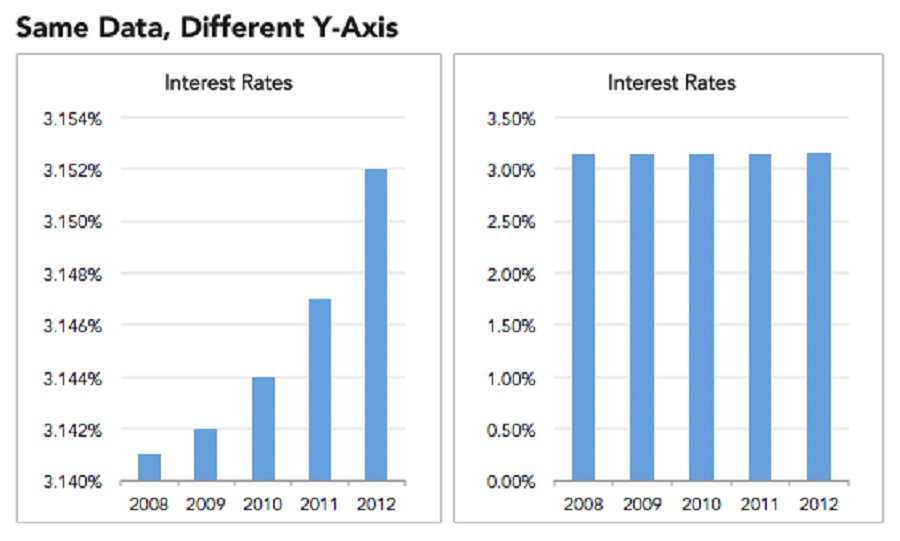
Check out the y-axes on those images. (For those you’ve forgotten their year-five maths, the x-axis is the horizontal line and the y-axis the vertical.) Notice anything odd? For one thing, they start at different values. Second, they’re plotted on different scales (the values for the Spectator are further apart). Why might that be?
Because if you plot them all on the same scale, the results paint a rather less flattering picture of the magazine’s fortunes:
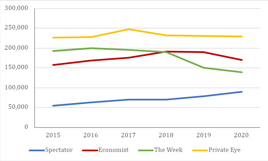
At the end of the day, though, this is hardly novichokking a kindergarten, is it? It’s just rascally old Uncle Andy, cheekily tweaking the data to make his grubby little publication look a bit more appealing to prospective readers and advertisers.
But if that was all people were using these tricks for, I wouldn’t be writing this.
I started this series of posts because while people aren’t too bad at working out when they’re being lied to with words, our numbers game is a little less surefooted. And that seems to go double (= two times as much) for data presented in visual form: graphs, charts and tables, collectively known as graphics, or data vis.
Pictures and graphs lend an authority to data that words cannot. Our internal logic goes something like this: “Surely, if someone’s taken the trouble of researching, compiling and publishing a graph or a chart, they must know their stuff – and they must be telling the truth!”
Here’s the rebuttal to the first part of your thesis, internal logic:
As for the second part: truth doesn’t pay the bills (case in point: this blog). When people take great pains over something, there’s a distinct possibility that murkier motives are in play. Below are some examples to show you what I mean.
Quarter pounders
Until recently, you couldn’t move online for Tories excitedly parroting the news that the UK was the “fastest-growing economy in the G7”. (You’ll notice that not many of them are still flogging that particular horse. We’re about to see why.) But few of them bothered to include the data on which they were basing their claim.
The main problem with data visualisation is that it’s rarely possible to fit all the relevant data into your visualisation. Presenting numerical information inevitably involves making choices about what to include and what to leave out. If you want to illustrate the performance of the top 100 companies on the Financial Times Share Index in your newspaper, for example, you physically can’t represent every data point going back to its inception in 1984 without some sort of gatefold. So you go back as far as space will allow, and present what you hope is enough data to paint a meaningful picture. For share prices, such cherry-picking doesn’t matter so much. GDP figures are a different story.
Below is the data on which the Tories were basing their uplifting, Brexit’s-so-brilliant claim. And sure, in itself, it’s quite correct. A bigger gradient means a higher rate of growth, and on that metric, the UK really was leading the world.
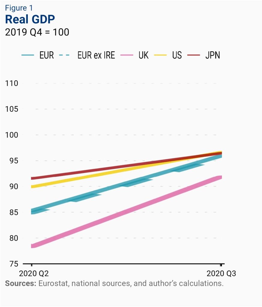
But there are two problems with extrapolating this conclusion from this data. First, look at the actual values of those lines. The UK is bottom of the heap, both at the beginning and the end of the period. What this means is that the UK economy was faring worse, relative to its performance in 2017, than all its rivals (the widely accepted explanation for this is that the UK was hit the hardest economically by the pandemic, and was therefore recovering from a lower base. It was bound to be “fastest growing” at some point).
The second issue is that this is the smallest possible range of data. It shows us how the UK fared economically against comparable countries over a single quarter. Zooming out a bit, the picture looks rather different:
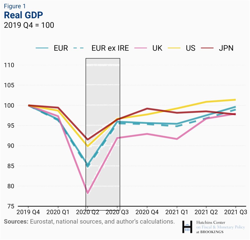
On the longer-term trend – which is the only trend that matters here – the UK’s performance is woeful. And why wouldn’t it be, with all those lovely trade barriers it’s thrown up with its nearest neighbours and biggest trading partners?
To interpret this graph as “the UK is the fastest-growing economy in the G7” is cherry-picking of the most outrageous order – straight up lying with figures – and yet practically no one ever calls it out.
Information dumped
In the next example, which was also shared with great enthusiasm by Tories in March 2022, once again, it’s not what the visual data is telling you, but what it isn’t, that’s significant.
Where’s that smell of roses coming from? Oh! Quelle surprise, it’s the UK again! What a world-beating nation it is!
The first thing that should set your Spidey sense tingling is the lack of any source on the graphic. (Turns out it was the Foreign, Commonwealth & Development Office, who posted this tweet, but when challenged, they declined to reveal their workings. The write-up of their exchange is worth a read.)
But once again, the most urgent problem is that we are missing crucial information. We have no idea what these figures represent as a percentage of the total Russian assets invested in those territories. If £1tn of Russian assets are invested in the UK economy, and only £40bn in the EU, then who is doing the better job on sanctions? (Definitive figures on the amount of Russian capital sloshing around the world are hard to come by, but the UK has long been oligarchs’ favourite spot to invest in property, and the bulk of Russian financial assets will inevitably have been parked in or near the City of London, the world’s leading financial centre.)
If you made a chart comparing how well-travelled Jason and Arthur are, showing that Jason has only been to France and Arthur has been to 50-plus countries, surely you’d think it apposite to mention that Jason is 14 and Arthur is 62?
Y, MIA
Once you’ve checked the bottom of a graphic for a source, and ascertained whether the x-axis is really as wide as it should be, the next place to look is at the y-axis. Does it start at zero? Why not?
If you tinker with the scale by selecting a narrow range of values, you can make differences appear as big or as small as you like.
Rotten Apple
In 2013, Apple CEO Tim Cook used the following graph as part of his presentation to mark the launch of the latest iPhone:
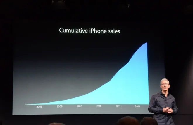
We’ve already seen that the omission of any units on an y-axis is a cardinal statistical sin. But that’s not all that’s off kilter here. Usually, when illustrating a company’s sales, you show the units sold in each time period. But this is a depiction of cumulative sales. Short of a mass product recall, cumulative sales never go down! Anyone armed with a jot of mathematical nous should spot that that decrease in gradient at the top right of the graph means sales are falling.
Chartjunk
Be wary of tables tarted up with bright colours, flashy fonts and pictorial elements. Yes, it might look more arresting, but it can also be harder to make sense of. The statistician, designer and artist Edward Tufte, one of the fathers of modern data visualisation, coined the term “data-ink ratio” to describe the proportion of a graphic that is essential to the communication of data. In his view, this should always be as close as possible to 1. The more bells and whistles a graphic has, the more sceptical you should be.
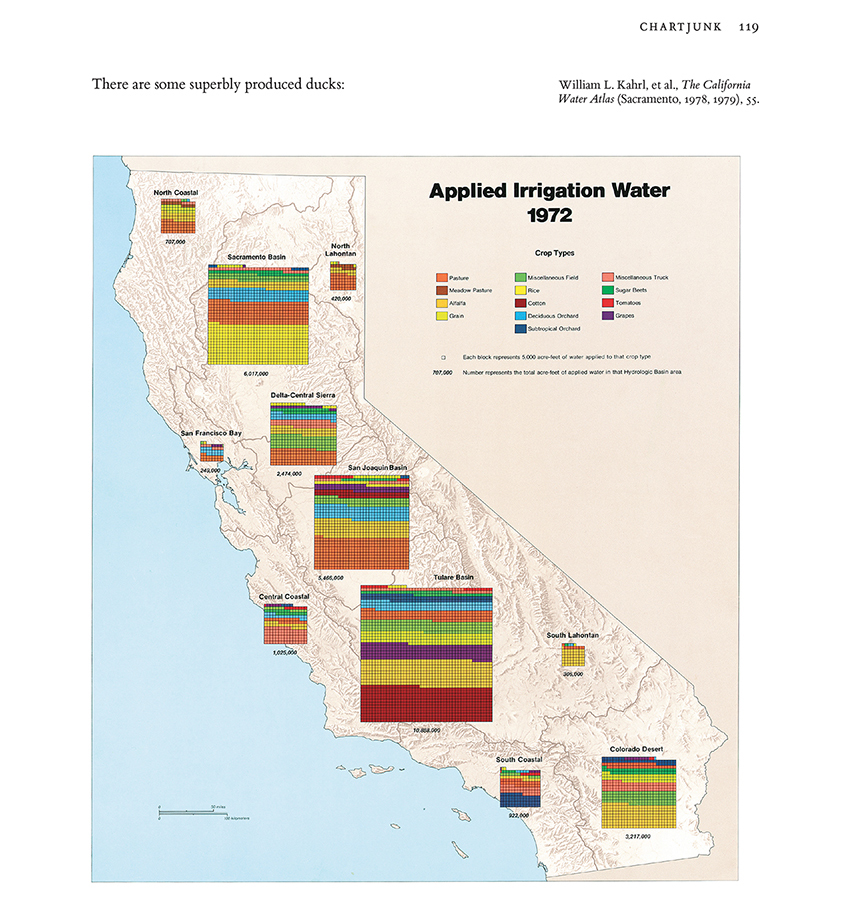
A common form of “chartjunk” is the use of images to illustrate the quantities involved.
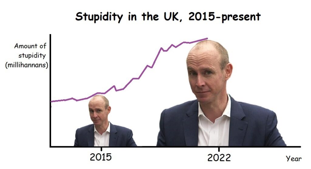
According to the data in this graph, the amount of stupidity in Britain has doubled since 2015. To reflect this, the graphic designer (me) has made Daniel Hannan’s stupid head twice as tall at 2022 as it is at 2015. However, because images are two-dimensional, the second Hannan is actually four times as large as the first. The use of images here has created a misleading impression.
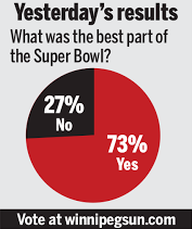
Porky pies
Even the humble pie chart is routinely mishandled. Here’s Fox News up to its perennial tricks:
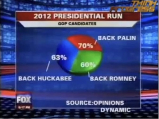
Presumably, even some MAGA types are aware that the segments of a pie chart should add up to 100%. What Fox have probably done is ask a question and permitted multiple answers. The results of such questions should never be represented in pie-chart form; a bar chart would be more appropriate.
Some of the more ostentatious data designers like to show off their Photoshop skills with 3D pie charts that seem to leap out of the page. But while they’re more visually arresting than their 2D counterparts, they’re less useful for displaying information, because the perspective distorts the respective quantities, making the slices at the “front” appear bigger than they in fact are, and the slices at the “back” smaller.
Pretty patterns
Finally, just because two things are sitting together on a graph or chart, it doesn’t mean there is any relationship between them. You can plot anything against anything. Here’s just one example of researchers finding a correlation between two completely independent phenomena.
Even when there is a relationship, it doesn’t mean one thing is directly causing the other. Sometimes, a third, unmentioned force – known as a “confounding variable” – is at work.
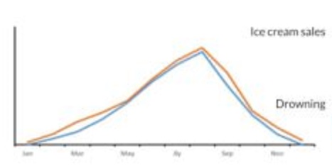
It’s hard to see what role ice-cream consumption could play in the rate at which people drown, or vice versa. The true explanation for the relationship, of course, is the confounding variable of temperature. When it’s hot, people eat more ice-cream, and go swimming more often.
Similarly, a US study in the 1950s revealed that far more people were killed on the roads at 7pm than at 7am. “Goodness,” some wondered. “Why are there so many more bad drivers around in the evening than first thing in the morning?”
And the answer is: there are more drivers around in the evening than in the morning. The confounding variable here was simply the number of people on the road.
Apples and oranges
In the early 20th century, the US Navy launched a recruitment campaign based on the premise that serving in the navy was safer than being a civilian. And their statistics were sound: the death rate among serving naval officers was indeed lower than in the general populace.
The stumbling block in this case was that they were not comparing like with like. Sailors, almost without exception, are young and fit. The general populace, meanwhile, includes infants, old people and long-term sick people, all of whom (at least at that time) were far more likely to die than the average able seaman.
Graphic non-fiction v graphic novels
The watchwords for visual data, then, are pretty much the same as for verbal information: transparency, clarity, simplicity.
When deciding whether or not to trust visual data, your checklist should be as follows:
- Source
- Units
- y-axis
- Large range of values
- Context: is there any other information, omitted from this visual element, that would be useful for a fuller understanding of the subject?
I’ll conclude this series soon with a round-up of all the other potential abuses of stats.